• Client type: National mass retailer
• Program type: Private brand development — visual identity, product design, and brand guide for a hand and power tool brand launched in 2017
• Services involved: Brand identity development, visual design, product design, brand guide development
• Operational pillar: Develop
A private tool brand needs more than a name. It needs visual language and design elements that a consumer can identify on a shelf, in a toolbox, or on a worksite without reading the label. Those elements need to work across an entire product line and be documented in a brand guide that every supplier in the program could follow.
In 2017, a national mass retailer decided to launch a private brand for hand and power tools. The retailer reached out to a small number of suppliers to help develop the brand’s visual identity, including the brand guide and brand language that would govern its appearance across the entire product line.
Test Rite led the development of the brand's visual identity, working directly with the retailer and its factory partners to produce the designs that became the foundation of the brand guide and brand language.
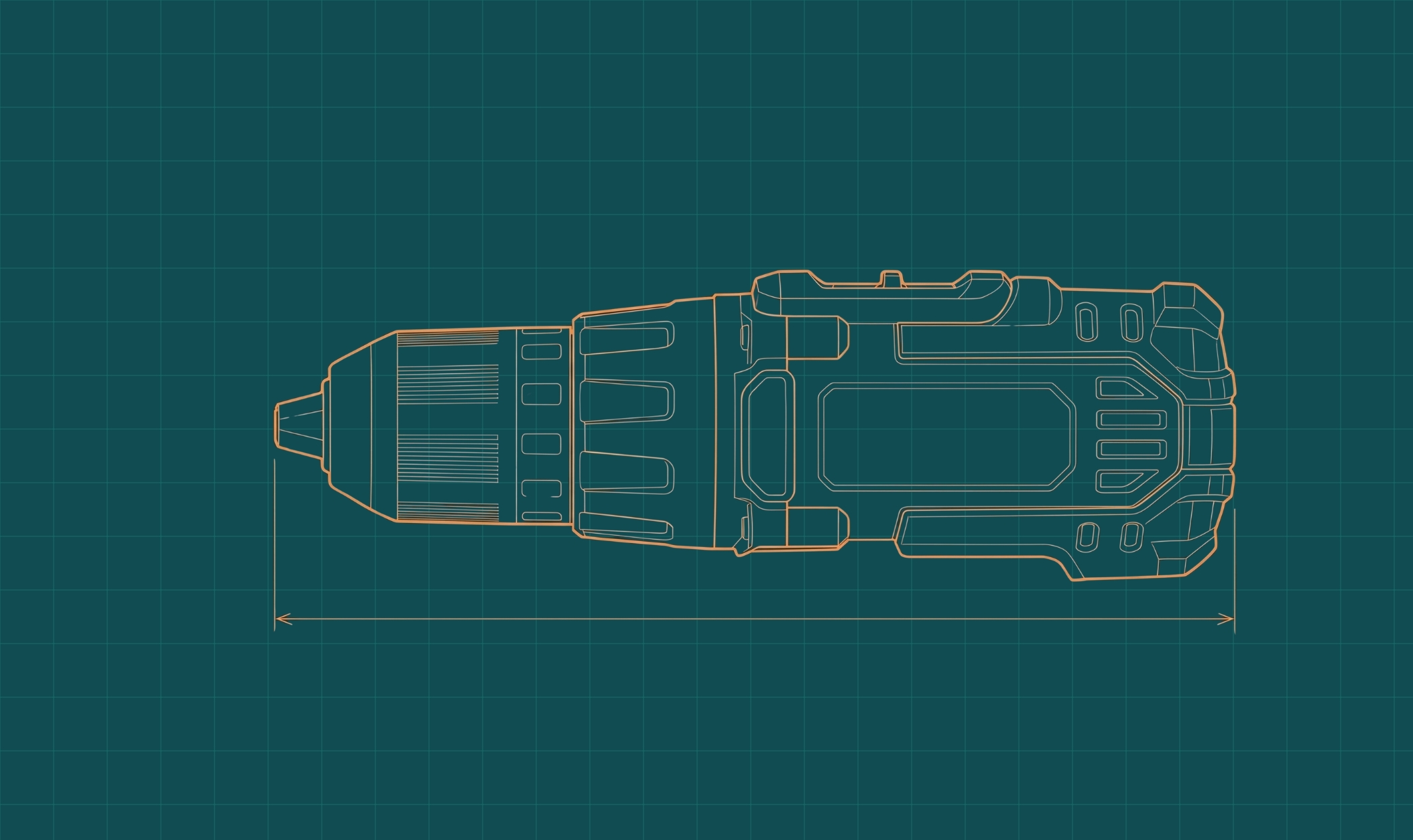
The Socket Design
The most distinctive contribution was the socket shape — a hexagonal design applied to tool handles that Test Rite developed in collaboration with its factory partners — which became the central visual element of the new brand.
The socket shape now appears on every tool in the line. A consumer can identify the brand from the shape alone, without seeing the logo — the same way a yellow drill signals one brand and a red tool signals another. It is the guiding design factor across every category the brand has expanded into.
From Test Rite's Designs to a Brand Guide for All Suppliers
Test Rite produced a range of designs through the process, with the socket shape as the central element. The retailer took those designs and worked with a design agency to build a formal visual brand guide. That brand guide, built on the design Test Rite produced at the brand's launch, is now distributed to every supplier producing products under the brand and serves as the standard every supplier in the program works from today.
The brand launched in 2017 with a visual identity built on Test Rite's design. The brand has grown into a $1.5 billion brand at the retailer. The socket shape Test Rite developed is the visual standard the entire brand is built around — on every tool, across every supplier, in every category the brand has expanded into.
As the brand grew to include smaller tool accessories, Test Rite built the distribution program that allowed those products to reach approximately 4,200 stores. For more on how Test Rite solved the distribution side of that program, see the Direct-to-Store Distribution case study.
A brand that did not exist in 2017 carries a visual identity that consumers recognize without reading a label.